
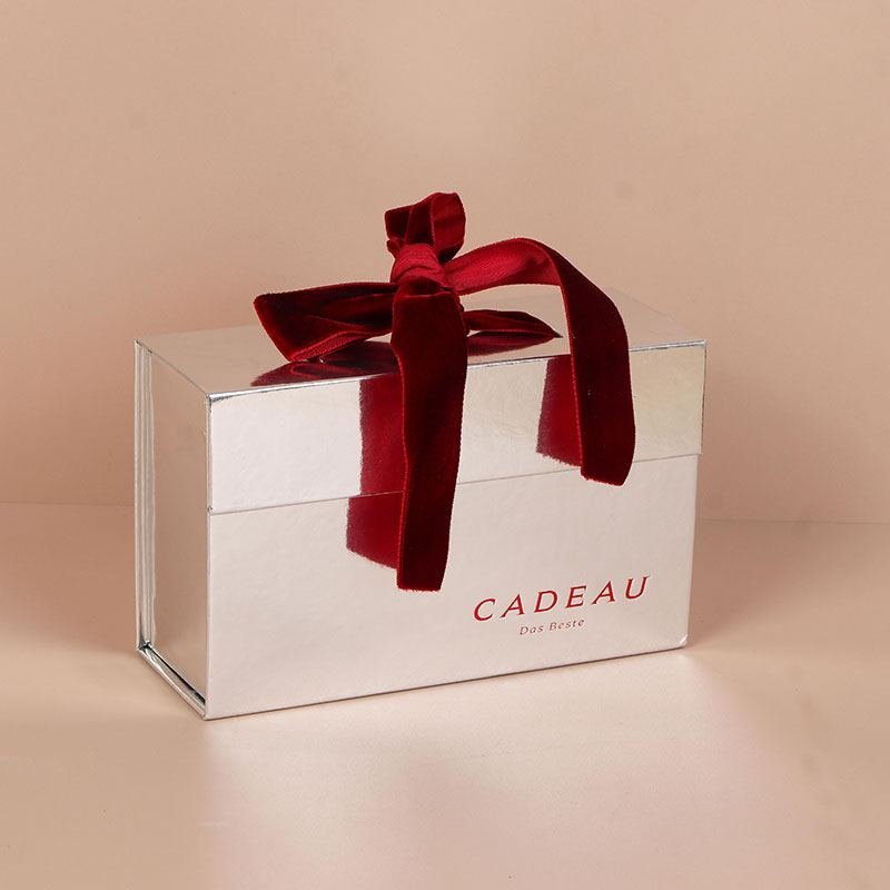
Cosmetic packaging is often the first physical interaction a customer has with a beauty product. Before opening a bottle, cream jar, serum, or fragrance, customers see the box, touch its surface, and experience the way it opens.
That makes cosmetic box design more than a visual exercise.
A successful cosmetic box needs to balance brand identity, product protection, functionality, sustainability, and the unboxing experience.
At the same time, beauty packaging is evolving. Many brands are exploring cleaner layouts, simpler structures, recyclable paper-based materials, and more restrained finishing. Minimalist packaging and sustainable packaging are becoming important design directions, but neither works automatically. Poor execution can make a simple box look unfinished rather than premium.
This guide looks at common cosmetic box design mistakes and explains how brands can approach minimalist and sustainable packaging more effectively.
1. Choosing the Wrong Box Structure
One of the first decisions in cosmetic packaging is the box structure.
A packaging design may look attractive in a digital mockup but become impractical once the actual product is placed inside.
For example, a glass perfume bottle requires different structural considerations from a lightweight skincare tube. A multi-product skincare set may also require an insert to keep several items organized.
Common cosmetic box structures include:
- Folding cartons
- Rigid setup boxes
- Drawer boxes
- Magnetic closure boxes
- Lid-and-base boxes
- Flip-top boxes
- Custom-shaped boxes
The right structure depends on the product dimensions, weight, protection requirements, retail environment, and desired unboxing experience.
Before finalizing the artwork, brands should consider the complete packaging structure rather than focusing only on the exterior design.
2. Designing Only for Appearance
A cosmetic box needs to look good, but appearance is only one part of the packaging experience.
A visually attractive box can still create problems if:
- The product moves inside the box
- The box is difficult to open
- The structure is too weak for the product
- The insert does not hold the product securely
- The packaging uses unnecessary material
- The finished box does not match the physical product
For premium cosmetics, the relationship between the exterior and interior is particularly important.
The outside creates the first impression. The interior determines what happens when the customer opens the box.
Good cosmetic packaging design considers both.
3. Ignoring the Unboxing Experience
Opening a cosmetic box is part of the product experience.
The sequence can include removing an outer sleeve, opening a magnetic lid, lifting an insert, revealing the product, and discovering additional information or accessories.
Each step contributes to how the customer perceives the brand.
However, an elaborate unboxing experience is not always better.
A box that requires too much effort to open can become frustrating. A package with excessive layers can also create unnecessary material waste.
The goal should be a controlled and intuitive unboxing experience.
The customer should understand how to open the packaging while still experiencing a sense of discovery.
4. Using Too Many Decorative Elements
Luxury packaging does not necessarily require more decoration.
Gold foil, embossing, metallic paper, textured finishes, ribbons, special shapes, and multiple colors can all create visual interest. But combining too many effects can make the packaging feel crowded.
This is one reason minimalist cosmetic packaging has become an interesting design direction.
Instead of adding more elements, designers can focus on a smaller number of carefully selected details.
For example, a simple white or neutral box combined with subtle embossing and a carefully positioned logo can create a stronger visual hierarchy than a box covered with multiple decorative effects.
The important question is not:
“How many finishing techniques can we use?”
It is:
“Which finishing techniques support the brand identity?”
5. Minimalist Packaging Is Not the Same as Plain Packaging
Minimalist packaging is sometimes misunderstood as simply using fewer colors or removing graphics.
In reality, successful minimalism requires careful decisions.
When a design contains fewer visual elements, small details become more noticeable.
Typography, spacing, proportions, paper texture, logo placement, structural details, and finishing can all have a larger influence on the final appearance.
For example, a minimalist cosmetic box might use:
- A restrained color palette
- Simple typography
- One primary brand element
- Subtle paper texture
- A clean structural design
- One carefully selected finishing technique
The result can feel modern and premium without being visually complicated.
Minimalism therefore requires more control, not simply fewer design elements.
6. Sustainable Cosmetic Packaging Needs More Than a Green Appearance
Sustainable packaging is another important consideration for beauty brands.
However, sustainability should not be reduced to using green colors, leaf graphics, or words such as “eco” on the packaging.
A more responsible approach begins with the actual packaging system.
Brands can consider:
- Paper-based materials
- Recyclable structures
- Reducing unnecessary packaging components
- Optimizing the box size for the product
- Using inserts only where they provide a clear function
- Selecting appropriate coatings and finishes
- Designing packaging that can be handled through existing recycling systems where applicable
Material selection should also be considered together with product protection.
A package that uses less material but fails to protect the product may create additional waste through damaged products and replacements.
The objective is to find an appropriate balance between material efficiency, protection, appearance, and functionality.
7. Making the Box Too Large for the Product
Oversized cosmetic packaging can create several problems.
A large empty space may require additional inserts or protective material. It can also increase storage and transportation requirements.
A properly sized box can provide a more intentional presentation while reducing unnecessary space.
This is particularly important for products such as:
- Perfume bottles
- Serum bottles
- Cream jars
- Lipstick sets
- Skincare gift sets
- Beauty accessories
The box should be designed around the actual product dimensions whenever possible.
A custom insert can then help position the product and create a cleaner presentation.
8. Forgetting the Physical Material Experience
Digital mockups cannot completely reproduce the physical experience of packaging.
A design may look excellent on a screen but feel different when printed and manufactured.
Material selection affects:
- Color appearance
- Surface texture
- Reflectivity
- Perceived weight
- Stiffness
- Touch
- Light reflection
For example, matte paper creates a different impression from high-shine metallic paper.
Soft-touch lamination feels different from an uncoated surface.
Embossing creates a physical detail that cannot be fully understood from a flat digital image.
For premium cosmetic packaging, physical sampling is therefore an important part of evaluating the final design.
9. Choosing Finishing Techniques Without a Clear Purpose
Finishing techniques should support the packaging concept.
Some commonly used options include:
Hot Stamping
Metallic foil can highlight logos, typography, borders, or selected design elements.
Embossing and Debossing
These techniques add physical depth and can work particularly well with minimalist designs.
UV Printing
UV printing can create sharp graphic details and can be used for selected branding elements.
Metallic Finishes
Metallic papers and coatings can create reflective surfaces suitable for luxury-oriented packaging.
Soft-Touch Finishes
Soft-touch surfaces can create a smoother tactile experience and change the way a package feels in the hand.
The best choice depends on the brand, product category, budget, and desired customer experience.
10. Designing Without Considering the Brand Positioning
A cosmetic box should look like it belongs to the brand.
A youthful skincare company may use completely different packaging from a luxury fragrance brand.
Before choosing colors, structures, and finishes, designers should consider:
- Target customer
- Product price positioning
- Brand personality
- Retail environment
- Product category
- Competitor packaging
- Desired customer experience
For example, minimalist packaging can communicate modernity and restraint, while richer materials and decorative details may communicate luxury or heritage.
There is no single packaging style that works for every beauty brand.
How Minimalist and Sustainable Packaging Can Work Together
Minimalist design and sustainable packaging do not have to be separate trends.
They can support each other when the packaging is designed carefully.
A simpler package may reduce unnecessary decorative components, while recyclable paper-based structures can provide a more straightforward material system.
For example, a cosmetic brand might choose:
Simple structure + paper-based material + restrained printing + one premium finishing detail
Instead of:
Complex structure + multiple materials + excessive decoration + several finishing processes
The first approach may create a cleaner visual identity while also reducing unnecessary complexity.
However, the actual environmental impact depends on the materials, manufacturing processes, coatings, adhesives, transportation, and end-of-life options involved.
Sustainability should therefore be evaluated as a packaging system rather than judged by appearance alone.
A Practical Cosmetic Box Design Checklist
Before approving a cosmetic packaging design, ask:
Structure
- Is the box structure suitable for the product?
- Is the product securely positioned?
- Is the box easy to open and close?
Appearance
- Does the design match the brand identity?
- Is there a clear visual hierarchy?
- Are finishing techniques being used intentionally?
Materials
- Is the material appropriate for the product?
- Is the box unnecessarily oversized?
- Can unnecessary components be removed?
Sustainability
- Are recyclable or more appropriate materials available?
- Are coatings, adhesives, and inserts being considered?
- Is the packaging system unnecessarily complex?
Customer Experience
- Does the packaging feel good in the hand?
- Is the unboxing sequence intuitive?
- Does the physical sample match the digital design?
Final Thoughts
The strongest cosmetic box designs are not necessarily the most complicated.
They are the ones that successfully connect visual identity, structure, material, functionality, protection, and customer experience.
Minimalist packaging can make a beauty brand feel more modern and intentional, while sustainable packaging can help brands reconsider how materials and packaging components are selected.
But both approaches depend on execution.
A simple box still needs the right structure. Sustainable packaging still needs to protect the product. Premium packaging still needs to be practical.
The best cosmetic packaging is where these elements work together rather than competing with each other.
What do you think makes a cosmetic box feel premium: the design, the material, the structure, or the unboxing experience?
